AI Icon Box helps you to make your website more accessible to potential customers. This sleek widget displays all of your important contact information in one place, making it easy for users to contact you. With customizable icons and color options, the Contact Widget can be tailored to match the aesthetic of your website.
How to set up the Icon Box:
Step 1: Search and find Icon Box in the search box under the Elements Tab. After that, easily drag and drop the widget wherever you want inside the Elementor section.
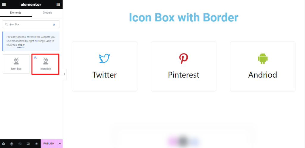
Step 2: This is how the element will look after inserting Icon Box.
How to set up content for the Icon Box?
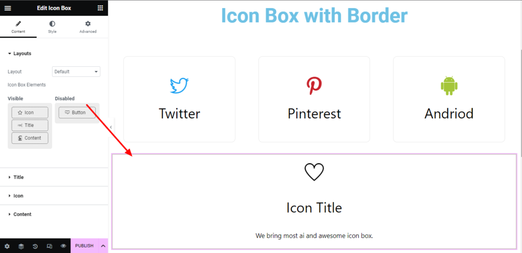
Under the content tab, you will be able to configure the AI Icon Box.
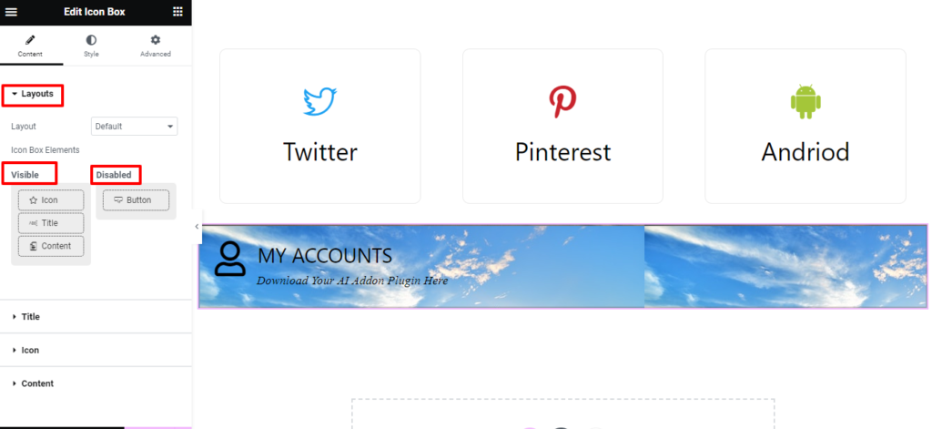
Layout: There are four different options available to modify the layout of the Icon Box. Just play around to know more about the layout options. Additionally, you can simply drag and drop the Icon Box Elements to arrange them in a particular sequence, such as what should come first and second, or you can deactivate a particular Icon in the section by dragging from the Visible to Disable section.
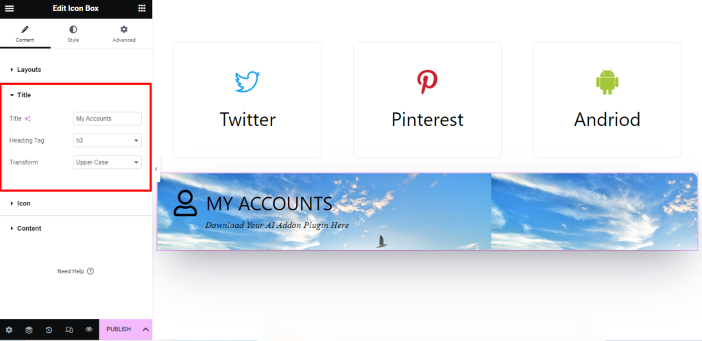
Title: You have the freedom to change the title in the Title area to suit your needs. Enter the text in the title box, choose an H1, H2, or other tags in the Heading Tag section, and then use the dropdown menu to change the title’s case to all uppercase, lowercase, and capital letters.
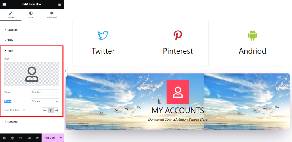
Icon: From this section, you can choose Icon from Icon Library or SVG Image. Besides you can set the Icon Shape, View, and Position here.
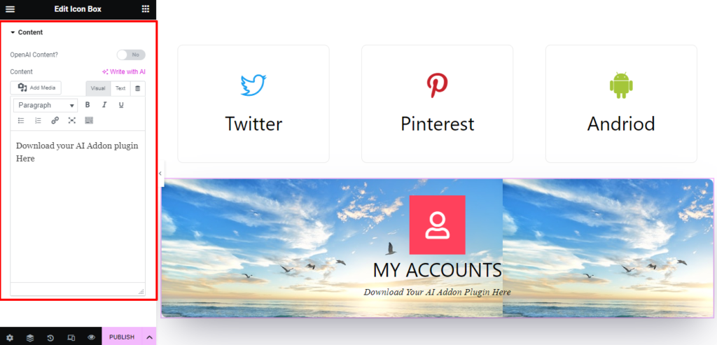
Content: Write the text that will be displayed beneath the title so the visitors can understand the information without navigating to some other page.
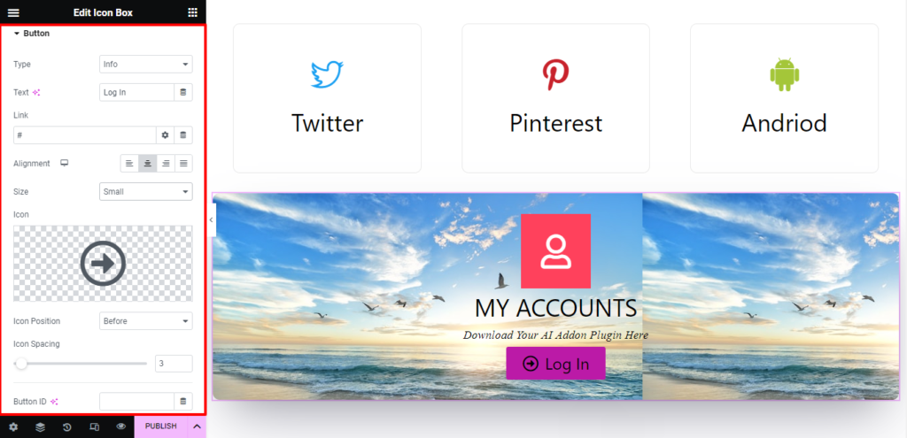
Button: From the Button section, select the Type of Button you want in the drop-down list. Put the text you want to appear in the button’s text box. Attach a link to the button so that it can direct viewers to the desired website/page. In the Alignment section, you can additionally align the button to the left, right, center, or justified. Besides, you can control the Icon size, position, and spacing in this section. Additionally, you can put an icon inside the button by choosing an SVG image or an icon from the Library.
.
How to add Styles in the Icon Box?
Icon Box: You have the freedom to set how you want the Icon Box to appear when it is in normal view and when the mouse hovers over it. For both cases, You can change the Icon Box Color, Background Color, Border Type, and alignment and add Box Shadow separately.
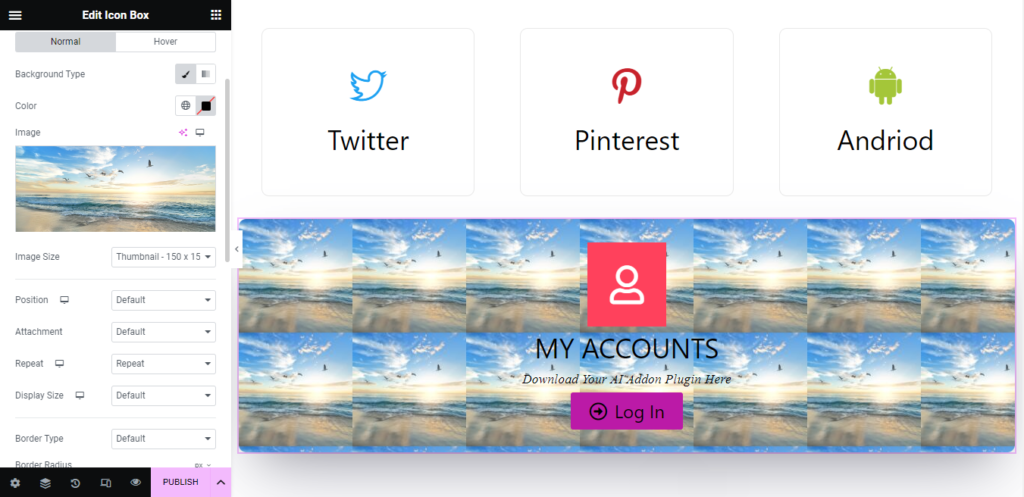
If the icon box’s background is configured to be an image, you can adjust its appearance at each step by changing the image’s size, position, attachment, repetition, and display size. You can further play around to come up with other design options.
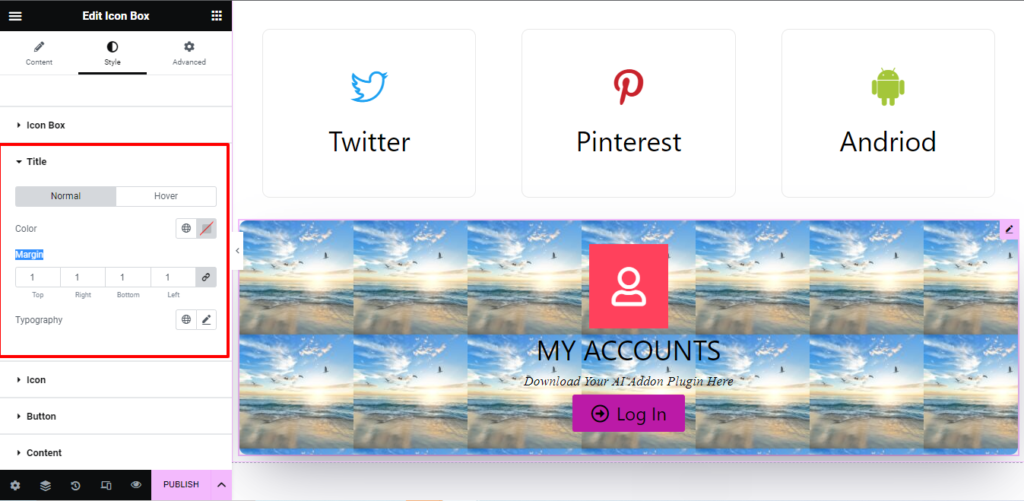
Title: Set the Title color to display how you prefer both in normal view and when the mouse is hovered over it. Also, you can modify the Margin and Typography of the Text in this section.
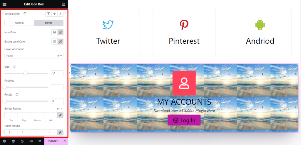
Icon: In this section, you can customize the Icon Color, Background Color, Size, Padding, Rotate, Border Radius, Outer Margin, and Box Shadow of the Icon in Normal and Hovering modes. You can choose any animation effect from the Hover Animation drop-down box.
Button: In this section, you can customize the Text Color, Background Color, Size, Padding, Rotate, Border Radius, Border Type, Typography, and Box Shadow of the Text in Normal and Hovering modes. You can choose any animation effect you want from the Hover Animation drop-down box.
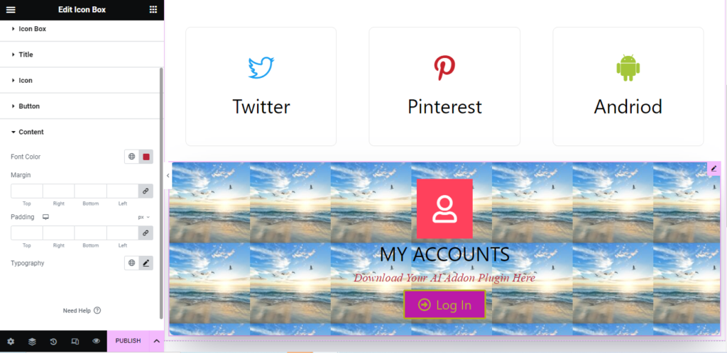
Content: Set the Font color to display the content(Below the Title). Also, you can modify the Margin, Padding, and Typography of the Content here.
With the help of Icon Box, you can do to make your Website more eye-catching and engaging website.